Chapter 7: Processing

Decisions, decisions, decisions. This chapter will help you decide how to crop, when to work in color versus black-and-white, how to deal with imperfections, and how to compose your shots.
40. Develop your unique style
Thanks to the advancements in camera technology, anyone can be a photographer. Although this has leveled the playing field, it also means that we are barraged with mediocre photos on the Web. The sheer volume of images makes it difficult to get noticed.
If your goal is to stand out and reach a larger audience, it’s crucial to develop a unique style. You need to make your pictures instantly recognizable. For example, if your specialty is street portraits, use the same lens and focal length for every one of them. If you like to use juxtaposition, create a body of work that consistently shows it used in humorous or fascinating ways.
Finding—and sticking with—your style will help when you’re building your brand. However, finding your personal style requires a lot of experimentation. Take your time! Sticking to one single style too soon in your photographic career is like putting your creativity into a straightjacket. Never constrain yourself to one single style if you have yet to find your own. In the end, you should always be shooting for yourself—not for others.
41. Know when to work in black and white
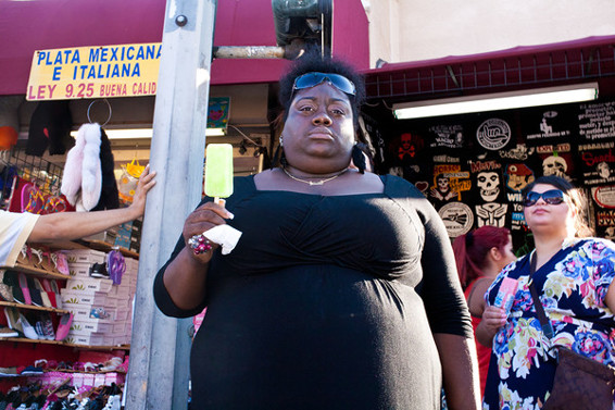
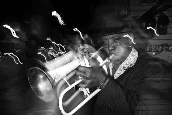
Most street photographs are in black and white. This is probably because the old masters used black and white film (it was all they could afford). Hence, it looks vintage and retro. But even though many contemporary street photographers prefer black and white, there’s no reason you shouldn’t use color if you are so inclined. There are many examples of great color street photography.
Don’t convert your images to black and white just because it’s common to do so. Judge each and every picture for its own potential. Photographs that benefit from conversion to black and white are the ones with shadows, silhouettes, and the formal elements of art. By translating the different colors into shades of gray, you help viewers focus on the composition rather than the colors. And since we see the world in color, a black and white image allows us to transcend reality.
Personally, I shoot RAW but set up my camera so that my previews are in black and white. Even if the preview is just a rough approximation of what I create later in post processing, it still gives me a good idea of how the image will turn out. And the cool thing about RAW is that you can process both a color and a black and white image from the same original. Don’t know which one to choose? Try both!

42. Know when to work in color
Color not only adds another dimension to a photograph, it also carries a powerful symbolic value. For example, a woman in a red dress against a neutral background can easily convey a feeling of danger, sexuality, or mystery.
When you work with color in your street photography, use the color to tell your story and strengthen your message. For example, the color yellow draws attention. Use it to lead your viewers’ eyes to key elements in your image. The color blue is said to be peaceful and calm. Green can imply growth and hope, but is also said to trigger jealousy. (Have you ever been green with envy?)
Let the feeling or message you want to convey determine how to process your image. Let’s say you took a photo of a person looking out over a beach, with the clear blue ocean in the background. If you want to emphasize the scene’s sense of peacefulness and tranquility, the blue of the sky and ocean becomes important. The choice is obviously to keep the colors. However, if you’d rather create a feeling of uneasiness, you could make it a high-contrast black and white to make the ocean and sky look ominous and menacing.
Juxtaposing colors also works well. Try, for example, to place red and green elements next to each other. Or try to find a person dressed in green in front of an all-green background, such as a hedge or some shrubbery. Setting pairs of complementary colors next to each other can also be powerful. Complementary colors are red and green, blue and orange, yellow and violet.
Turning a great color photograph into black and white can rob it of all meaning. Use color whenever it is to your advantage, and have fun with it.

43. Accept imperfections
Many people obsess over technical perfection; images should be grain-free and razor sharp! However, in street photography these properties are rarely the most important ones. In fact, technical imperfections can often add realism and make your images come to life.
Personally, I like my images to have a bit of grain. I feel that it adds dimension and makes the images appear raw and real. To me, images that are too clean and perfect often look soulless and fake. Therefore, don’t hesitate to shoot at ISO 800 and above. A high ISO will also let you use shorter shutter speeds and achieve greater depth of field. That helps when it’s dark, when you want to capture moving subjects, and when you are using zone focusing (see Tip 24 on page 70). I often shoot at ISO 1600, or even 3200.
Blur from camera shake or a moving subject can also add to an image. Even if the blur was unintentional, it can make an image appear more dynamic and fluid. Experiment with longer shutter times to see what kinds of effects they create. And never delete any images when you are out shooting! The preview on the back of your camera is way too small to use for any kind of quality assessment. An image that may seem too technically flawed to bother with in the camera preview could turn out to be your best shot when viewed on your computer monitor.

44. Crop for a better story
Many street photographers frown at the concept of cropping. Perhaps they consider it to be bad form, cheating, or just plain wrong. However, cropping can be a highly effective tool for refining your composition and increasing its storytelling power.
Let’s say that you have identified a favorite among your shots, a keeper that tells an amazing story. Only, there’s this distracting element—a random person, a phone line, strange patterns, whatever—close to the edge. It ruins the shot. And it’s driving you crazy! There’s not one single good reason why you shouldn’t try to crop out the distracting element.
As a general rule of thumb, crop less than 10 percent of your image. By abiding to this rule, your image will maintain its resolution as well as its crucial ambiance and context. Remember from Chapter 2 that for street photography, telephoto lenses should be avoided. Considering that excessive cropping is essentially the same thing as using a digital telephoto lens, it should be avoided, too. In fact, it should be especially avoided, since image quality will degrade proportionally to the amount of cropping.

45. Show only your best work
Of all the recognized street photographers throughout history, few are known for more than a handful of images. However, these images are the cream of the crop: the best images they ever produced. And these images constitute a narrow selection of the few hundred images they ever published. Considering that these photographers probably took tens of thousands of images in their careers, it’s obvious they only showed a tiny fraction of their work.
Being this selective is necessary. Show only your best work and never show more than one version or variant of the same scene. For example, if you shot a scene in both landscape and portrait orientations, show only one of them. And because selection can be difficult, it may be wise to get feedback from friends and fellow photographers online before adding an image to your portfolio The first ten or so of your images that people come across have a major impact on your reputation as a photographer. At a time when it has become increasingly easy to produce and publish a myriad of photographs, having the discipline to show only your best work is more important than ever. Also, keep only street photographs in your street photography portfolio. If it also contains pictures of dogs and landscapes, you will probably lose parts of the audience you are trying to reach.

46. Identify your “keepers”
I define a “keeper” as a photo that’s good enough to be shown to other people and perhaps even good enough to be added to your portfolio. After a full day of shooting, I am lucky if I get one or two keepers. But every photographer is different. Many of us are even more selective with our work and might identify only one or two keepers a month.
Identifying your keepers from a big pile of shots is a skill that takes both time and effort to learn. The first question to ask yourself is: What makes a good street photograph? Try to answer that question for yourself by studying the work of street photography masters, such as Henri Cartier-Bresson, Robert Frank, and André Kertész. How do they frame their images? How do they tell stories through their images? What elements do they include? It might take quite a bit of studying and analyzing, but eventually you will develop a sense for what makes a good shot. And you’ll learn to identify your own keepers.
A pair of fresh eyes is your best friend in the selection process. The late photographer Garry Winogrand once said, “Photographers mistake the emotion they feel while taking the photo as a judgment that the photograph is good.” He would actually wait as long as a year to develop his rolls of film. Once the year had passed, he would feel emotionally disconnected enough to tackle his selection process more objectively. Waiting an entire year might be a bit extreme, but try to hold off at least a few days before uploading an image to the Web, and even longer to include it in your portfolio.