Chapter 2 described methods to explore the
relationship between two elements in a dataset. We could extract a
pair of elements and construct various plots. For vector data, we
could also compute the correlation between different pairs of
elements. But if each data item is d-dimensional, there could be a lot of
pairs to deal with, and it is hard to plot d-dimensional vectors.
To really get what is going
on we need methods that can represent all relationships in a
dataset in one go. These methods visualize the dataset as a “blob”
in a d-dimensional space.
Many such blobs are flattened in some directions, because
components of the data are strongly correlated. Finding the
directions in which the blobs are flat yields methods to compute
lower dimensional representations of the dataset. This analysis
yields an important practical fact. Most high dimensional datasets
consist of low dimensional data in a high dimensional space (think
of a line in 3D). Such datasets can be represented accurately using
a small number of directions. Finding these directions will give us
considerable insight into the structure of high dimensional
datasets.
10.1 Summaries and Simple Plots
In this chapter, we assume that our data items
are vectors. This means that we can add and subtract values and
multiply values by a scalar without any distress. This is an
important assumption, but it doesn’t necessarily mean that data is
continuous (for example, you can meaningfully add the number of
children in one family to the number of children in another
family). It does rule out a lot of discrete data. For example, you
can’t add “sports” to “grades” and expect a sensible answer.
When we plotted histograms, we saw that mean and
variance were a very helpful description of data that had a
unimodal histogram. If the histogram had more than one mode, one
needed to be somewhat careful to interpret the mean and variance;
in the pizza example, we plotted diameters for different
manufacturers to try and see the data as a collection of unimodal
histograms. In higher dimensions, the analogue of a unimodal
histogram is a “blob”—a group of data points that clusters nicely
together and should be understood together.
You might not believe that “blob” is a technical
term, but it’s quite widely used. This is because it is relatively
easy to understand a single blob of data. There are good summary
representations (mean and covariance, which I describe below). If a
dataset forms multiple blobs, we can usually coerce it into a
representation as a collection of blobs (using the methods of
Chap. 12). But many datasets really are
single blobs, and we concentrate on such data here. There are quite
useful tricks for understanding blobs of low dimension by plotting
them, which I describe below. To understand a high dimensional
blob, we will need to think about the coordinate transformations
that places it into a particularly convenient form.
Notation:
Our data items are vectors, and we write a vector as x. The data items are d-dimensional, and there are
N of them. The entire data
set is {x}. When we need to
refer to the i’th data
item, we write x
i . We write
{x i } for a new dataset made up of
N items, where the
i’th item is x i . If we need to refer to the
j’th component of a vector
x i , we will write x i (j) (notice this isn’t in bold,
because it is a component not a vector, and the j is in parentheses because it isn’t a
power). Vectors are always column vectors.
10.1.1 The Mean
For one-dimensional data, we wrote
 This expression is meaningful for vectors, too, because we can add
vectors and divide by scalars. We write
This expression is meaningful for vectors, too, because we can add
vectors and divide by scalars. We write
 and call this the mean of the data. Notice that each component of
 is the mean of that component of the data. There is not an easy
analogue of the median, however (how do you order high dimensional
data?) and this is a nuisance. Notice that, just as for the
one-dimensional mean, we have
is the mean of that component of the data. There is not an easy
analogue of the median, however (how do you order high dimensional
data?) and this is a nuisance. Notice that, just as for the
one-dimensional mean, we have
 (i.e. if you subtract the mean from a data set, the resulting data
set has zero mean).
(i.e. if you subtract the mean from a data set, the resulting data
set has zero mean).
is the mean of that component of the data. There is not an easy
analogue of the median, however (how do you order high dimensional
data?) and this is a nuisance. Notice that, just as for the
one-dimensional mean, we have
10.1.2 Stem Plots and Scatterplot Matrices
Plotting high dimensional data is tricky. If
there are relatively few dimensions, you could just choose two (or
three) of them and produce a 2D (or 3D) scatterplot.
Figure 10.1 shows such a scatterplot, for data that was
originally four dimensional. This is the famous Iris dataset,
collected by Edgar Anderson in 1936, and made popular amongst
statisticians by Ronald Fisher in that year. I found a copy at the
UC Irvine repository of datasets that are important in machine
learning. You can find the repository at http://archive.ics.uci.edu/ml/index.html.

Fig. 10.1
Left: a 2D scatterplot for the famous
Iris data. I have chosen two variables from the four, and have
plotted each species with a different marker. Right: a 3D scatterplot for the same
data. You can see from the plots that the species cluster quite
tightly, and are different from one another. If you compare the two
plots, you can see how suppressing a variable leads to a loss of
structure. Notice that, on the left, some crosses lie on top of
boxes; you can see that this is an effect of projection by looking
at the 3D picture (for each of these data points, the petal widths
are quite different). You should worry that leaving out the last
variable might have suppressed something important like this
Another simple but useful plotting mechanism is
the stem plot. This is can be a useful way to plot a few high
dimensional data points. One plots each component of the vector as
a vertical line, typically with a circle on the end (easier seen
than said; look at Fig. 10.2). The dataset I used for this is the wine
dataset, again from the UC Irvine machine learning data repository
(you can find this dataset at http://archive.ics.uci.edu/ml/datasets/Wine).
For each of three types of wine, the data records the values of 13
different attributes. In the figure, I show the overall mean of the
dataset, and also the mean of each type of wine (also known as the
class means, or class conditional means). A natural way to compare
class means is to plot them on top of one another in a stem plot
(Fig. 10.2).

Fig. 10.2
On the left, a stem plot of the mean of all
data items in the wine dataset, from http://archive.ics.uci.edu/ml/datasets/Wine.
On the right, I have
overlaid stem plots of each class mean from the wine dataset, from
http://archive.ics.uci.edu/ml/datasets/Wine,
so that you can see the differences between class means
Another strategy that is very useful when there
aren’t too many dimensions is to use a scatterplot matrix. To build
one, you lay out scatterplots for each pair of variables in a
matrix. On the diagonal, you name the variable that is the vertical
axis for each plot in the row, and the horizontal axis in the
column. This sounds more complicated than it is; look at the
example of Fig. 10.3, which shows both a 3D scatter plot and a
scatterplot matrix for the same dataset.

Fig. 10.3
Left: the 3D scatterplot of the iris
data of Fig. 10.1, for comparison. Right: a scatterplot matrix for the
Iris data. There are four variables, measured for each of three
species of iris. I have plotted each species with a different
marker. You can see from the plot that the species cluster quite
tightly, and are different from one another
Figure 10.4 shows a scatter plot matrix for four of the
variables in the height-weight dataset of http://www2.stetson.edu/~jrasp/data.htm
(look for bodyfat.xls at that URL). This is originally a
16-dimensional dataset, but a 16 by 16 scatterplot matrix is
squashed and hard to interpret. For Fig. 10.4, you can see that
weight and adiposity appear to show quite strong correlations, but
weight and age are pretty weakly correlated. Height and age seem to
have a low correlation. It is also easy to visualize unusual data
points. Usually one has an interactive process to do so—you can
move a “brush” over the plot to change the color of data points
under the brush.

Fig. 10.4
This is a scatterplot matrix for four of
the variables in the height weight dataset of http://www2.stetson.edu/~jrasp/data.htm.
Each plot is a scatterplot of a pair of variables. The name of the
variable for the horizontal axis is obtained by running your eye
down the column; for the vertical axis, along the row. Although
this plot is redundant (half of the plots are just flipped versions
of the other half), that redundancy makes it easier to follow
points by eye. You can look at a column, move down to a row, move
across to a column, etc. Notice how you can spot correlations
between variables and outliers (the arrows)
10.1.3 Covariance
Variance, standard deviation and correlation can
each be obtained by performing a more general operation on data. We
have a dataset  of N vectors x i , and we are interested in
relationships between the j’th and the k’th components. As with correlation,
we would like to know whether one component tends to be large
(resp. small) when the other is large. Remember that I write
x i (j) for the j’th component of the i’th vector.
of N vectors x i , and we are interested in
relationships between the j’th and the k’th components. As with correlation,
we would like to know whether one component tends to be large
(resp. small) when the other is large. Remember that I write
x i (j) for the j’th component of the i’th vector.
of N vectors x i , and we are interested in
relationships between the j’th and the k’th components. As with correlation,
we would like to know whether one component tends to be large
(resp. small) when the other is large. Remember that I write
x i (j) for the j’th component of the i’th vector.Definition 10.1 (Covariance)
We
compute the covariance by

Just like mean, standard deviation and variance,
covariance can refer either to a property of a dataset (as in the
definition here) or a particular expectation (as in
Chap. 4). From the expression, it should be
clear we have seen examples of covariance already. Notice that

which you can prove by substituting the
expressions. Recall that variance measures the tendency of a
dataset to be different from the mean, so the covariance of a
dataset with itself is a measure of its tendency not to be
constant. More important is the relationship between covariance and
correlation, in the box below.
Remember this:

This is occasionally a useful way to think about
correlation. It says that the correlation measures the tendency of
{x} and {y} to be larger (resp. smaller) than
their means for the same data points, compared to how much they change on
their own.
10.1.4 The Covariance Matrix
Working with covariance
(rather than correlation) allows us to unify some ideas. In
particular, for data items which are d dimensional vectors, it is
straightforward to compute a single matrix that captures all
covariances between all pairs of components—this is the covariance
matrix.
Definition 10.2 (Covariance Matrix)
The
covariance matrix is:
 Notice that it is quite usual to write a covariance matrix as
 , and
we will follow this convention.
, and
we will follow this convention.
, and
we will follow this convention.Covariance matrices are often written as
 ,
whatever the dataset (you get to figure out precisely which dataset
is intended, from context). Generally, when we want to refer to the
j, k’th entry of a matrix
,
whatever the dataset (you get to figure out precisely which dataset
is intended, from context). Generally, when we want to refer to the
j, k’th entry of a matrix  ,
we will write
,
we will write  , so
, so  is the covariance between the
j’th and k’th components of the data.
is the covariance between the
j’th and k’th components of the data.
,
whatever the dataset (you get to figure out precisely which dataset
is intended, from context). Generally, when we want to refer to the
j, k’th entry of a matrix ,
we will write , so is the covariance between the
j’th and k’th components of the data.Useful Facts 10.1 (Properties of the
Covariance Matrix)
-
The j, k’th entry of the covariance matrix is the covariance of the j’th and the k’th components of x, which we write
 .
. -
The j, j’th entry of the covariance matrix is the variance of the j’th component of x.
-
The covariance matrix is symmetric.
-
The covariance matrix is always positive semi-definite; it is positive definite, unless there is some vector a such that
 for all i.
Proposition

Proof
Recall
 and the j, k’th entry in this matrix will be
 which is
  .
.
.Proposition

Proof

Proposition

Proof
We have

Proposition
Write
 . If there is no vector
a such that
. If there is no vector
a such that  for all i, then for any
vector u , such that ∣∣ u ∣∣ > 0,
for all i, then for any
vector u , such that ∣∣ u ∣∣ > 0,
 If there is such a vector
a , then
If there is such a vector
a , then

. If there is no vector
a such that
for all i, then for any
vector u , such that ∣∣ u ∣∣ > 0,
Proof
We have
![$$\displaystyle\begin{array}{rcl} \mathbf{u}^{T}\Sigma \mathbf{u}& =& \frac{1} {N}\sum _{i}\left [\mathbf{u}^{T}(\mathbf{x}_{ i} -\mathsf{mean}\left (\left \{\mathbf{x}\right \}\right ))\right ]\left [(\mathbf{x}_{i} -\mathsf{mean}\left (\left \{\mathbf{x}\right \}\right ))^{T}\mathbf{u}\right ] {}\\ & =& \frac{1} {N}\sum _{i}\left [\mathbf{u}^{T}(\mathbf{x}_{ i} -\mathsf{mean}\left (\left \{\mathbf{x}\right \}\right ))\right ]^{2}. {}\\ \end{array}$$](A442674_1_En_10_Chapter_Equ8.gif) Now this is a sum of squares. If there is some a such that
Now this is a sum of squares. If there is some a such that  for every i, then the
covariance matrix must be positive semidefinite (because the sum of
squares could be zero in this case). Otherwise, it is positive
definite, because the sum of squares will always be positive.
for every i, then the
covariance matrix must be positive semidefinite (because the sum of
squares could be zero in this case). Otherwise, it is positive
definite, because the sum of squares will always be positive.
for every i, then the
covariance matrix must be positive semidefinite (because the sum of
squares could be zero in this case). Otherwise, it is positive
definite, because the sum of squares will always be positive.10.2 Using Mean and Covariance to Understand High Dimensional Data
The trick to interpreting high dimensional data
is to use the mean and covariance to understand the blob.
Figure 10.5 shows a two-dimensional data set. Notice
that there is obviously some correlation between the x and y coordinates (it’s a diagonal blob),
and that neither x nor
y has zero mean. We can
easily compute the mean and subtract it from the data points, and
this translates the blob so that the origin is at the mean
(Fig. 10.5).
The mean of the new, translated dataset is zero.

Fig. 10.5
On the left, a “blob” in two dimensions. This
is a set of data points that lie somewhat clustered around a single
center, given by the mean. I have plotted the mean of these data
points with a hollow square (it’s easier to see when there is a lot
of data). To translate the blob to the origin, we just subtract the
mean from each datapoint, yielding the blob on the right
Notice this blob is diagonal. We know what that
means from our study of correlation—the two measurements are
correlated. Now consider rotating the blob of data about the
origin. This doesn’t change the distance between any pair of
points, but it does change the overall appearance of the blob of
data. We can choose a rotation that means the blob looks (roughly!)
like an axis aligned ellipse. In
these coordinates there is no correlation between the
horizontal and vertical components. But one direction has more
variance than the other.
It turns out we can extend this approach to high
dimensional blobs. We will translate their mean to the origin, then
rotate the blob so that there is no correlation between any pair of
distinct components (this turns out to be straightforward, which
may not be obvious to you). Now the blob looks like an axis-aligned
ellipsoid, and we can reason about (a) what axes are “big” and (b)
what that means about the original dataset.
10.2.1 Mean and Covariance Under Affine Transformations
We have a d dimensional dataset {x}. An affine transformation of this data
is obtained by choosing some matrix  and vector b, then forming a new dataset
{m}, where
and vector b, then forming a new dataset
{m}, where  .
Here
.
Here  doesn’t have to be square, or symmetric, or anything else; it just
has to have second dimension d.
doesn’t have to be square, or symmetric, or anything else; it just
has to have second dimension d.
and vector b, then forming a new dataset
{m}, where .
Here
doesn’t have to be square, or symmetric, or anything else; it just
has to have second dimension d.It is easy to compute the mean and covariance of
{m}. We have
 so you get the new mean by multiplying the original mean by
 and adding b.
and adding b.The new covariance matrix is easy to compute as
well. We have:
![$$\displaystyle\begin{array}{rcl} \mathsf{Covmat}\left (\left \{\mathbf{m}\right \}\right )& =& \mathsf{Covmat}\left (\left \{\mathcal{A}\mathbf{x} + \mathbf{b}\right \}\right ) {}\\ & =& \frac{\sum _{i}(\mathbf{m}_{i} -\mathsf{mean}\left (\left \{\mathbf{m}\right \}\right ))(\mathbf{m}_{i} -\mathsf{mean}\left (\left \{\mathbf{m}\right \}\right ))^{T}} {N} {}\\ & =& \frac{\sum _{i}(\mathcal{A}\mathbf{x}_{i} + \mathbf{b} -\mathcal{A}\mathsf{mean}\left (\left \{\mathbf{x}\right \}\right ) -\mathbf{b})(\mathcal{A}\mathbf{x}_{i} + \mathbf{b} -\mathcal{A}\mathsf{mean}\left (\left \{\mathbf{x}\right \}\right ) -\mathbf{b})^{T}} {N} {}\\ & =& \frac{\mathcal{A}\left [\sum _{i}(\mathbf{x}_{i} -\mathsf{mean}\left (\left \{\mathbf{x}\right \}\right ))(\mathbf{x}_{i} -\mathsf{mean}\left (\left \{\mathbf{x}\right \}\right ))^{T}\right ]\mathcal{A}^{T}} {N} {}\\ & =& \mathcal{A}\mathsf{Covmat}\left (\left \{\mathbf{x}\right \}\right )\mathcal{A}^{T}. {}\\ \end{array}$$](A442674_1_En_10_Chapter_Equ10.gif)
All this means that we can try and choose affine
transformations that yield “good” means and covariance matrices. It
is natural to choose b so
that the mean of the new dataset is zero. An appropriate choice of
 can reveal a lot of information about the dataset.
can reveal a lot of information about the dataset.10.2.2 Eigenvectors and Diagonalization
Recall a matrix  is symmetric if
 . A symmetric matrix
is necessarily square. Assume
. A symmetric matrix
is necessarily square. Assume  is a d × d symmetric matrix, u is a d × 1 vector, and λ is a scalar. If we have
 then u is referred to as
an eigenvector of
then u is referred to as
an eigenvector of  and λ is the corresponding eigenvalue.
Matrices don’t have to be symmetric to have eigenvectors and
eigenvalues, but the symmetric case is the only one of interest to
us.
and λ is the corresponding eigenvalue.
Matrices don’t have to be symmetric to have eigenvectors and
eigenvalues, but the symmetric case is the only one of interest to
us.
is symmetric if
. A symmetric matrix
is necessarily square. Assume is a d × d symmetric matrix, u is a d × 1 vector, and λ is a scalar. If we have
and λ is the corresponding eigenvalue.
Matrices don’t have to be symmetric to have eigenvectors and
eigenvalues, but the symmetric case is the only one of interest to
us.In the case of a symmetric matrix, the
eigenvalues are real numbers, and there are d distinct eigenvectors that are normal
to one another, and can be scaled to have unit length. They can be
stacked into a matrix ![$$\mathcal{U} = \left [\mathbf{u}_{1},\ldots,\mathbf{u}_{d}\right ]$$](A442674_1_En_10_Chapter_IEq23.gif) .
This matrix is orthonormal, meaning that
.
This matrix is orthonormal, meaning that  .
.
.
This matrix is orthonormal, meaning that .This means that there is a diagonal matrix
 and
an orthonormal matrix
and
an orthonormal matrix  such that
 In fact, there is a large number of such matrices, because we can
reorder the eigenvectors in the matrix
In fact, there is a large number of such matrices, because we can
reorder the eigenvectors in the matrix  , and the equation still holds with a
new
, and the equation still holds with a
new  ,
obtained by reordering the diagonal elements of the original
,
obtained by reordering the diagonal elements of the original
 .
There is no reason to keep track of this complexity. Instead, we
adopt the convention that the elements of
.
There is no reason to keep track of this complexity. Instead, we
adopt the convention that the elements of  are always ordered so that the elements of
  are
sorted along the diagonal, with the largest value coming first.
This gives us a particularly important procedure.
are
sorted along the diagonal, with the largest value coming first.
This gives us a particularly important procedure.
and
an orthonormal matrix such that
, and the equation still holds with a
new ,
obtained by reordering the diagonal elements of the original
.
There is no reason to keep track of this complexity. Instead, we
adopt the convention that the elements of
are always ordered so that the elements of are
sorted along the diagonal, with the largest value coming first.
This gives us a particularly important procedure.Procedure 10.1 (Diagonalizing a Symmetric
Matrix)
We can convert any symmetric
matrix  to a diagonal form by computing
 Numerical and statistical programming environments have procedures
to compute
Numerical and statistical programming environments have procedures
to compute  and
and  for
you. We assume that the elements of
for
you. We assume that the elements of  are always ordered so that the elements
of
are always ordered so that the elements
of  are
sorted along the diagonal, with the largest value coming first.
are
sorted along the diagonal, with the largest value coming first.
to a diagonal form by computing
and for
you. We assume that the elements of are always ordered so that the elements
of are
sorted along the diagonal, with the largest value coming first.
Useful Facts 10.2 (Orthonormal Matrices
are Rotations)
You
should think of orthonormal matrices as rotations, because they do
not change lengths or angles. For x a vector,  an orthonormal matrix, and
  , we have
 This means that
  doesn’t change lengths. For y, z both unit vectors, we have that the
cosine of the angle between them is
doesn’t change lengths. For y, z both unit vectors, we have that the
cosine of the angle between them is
 By the argument above, the inner product of
  and
and  is the same as y T x. This means that
  doesn’t change angles, either.
an orthonormal matrix, and , we have
doesn’t change lengths. For y, z both unit vectors, we have that the
cosine of the angle between them is
and is the same as y T x. This means that
doesn’t change angles, either.10.2.3 Diagonalizing Covariance by Rotating Blobs
We start with a dataset of N d-dimensional vectors  . We can translate this
dataset to have zero mean, forming a new dataset {m} where
. We can translate this
dataset to have zero mean, forming a new dataset {m} where  .
Now recall that, if we were to form a new dataset {a} where
.
Now recall that, if we were to form a new dataset {a} where

. We can translate this
dataset to have zero mean, forming a new dataset {m} where .
Now recall that, if we were to form a new dataset {a} where
the covariance matrix of {a} would be
 Recall also we can diagonalize
  to get

to get
But this means we could form the dataset
{r}, using the rule
 The mean of this new dataset is clearly 0. The covariance of this dataset is
 where
where  is
a diagonal matrix of eigenvalues of
is
a diagonal matrix of eigenvalues of  that we obtained by diagonalization. We now have a very useful fact
about {r}: its covariance
matrix is diagonal. This means that every pair of distinct
components has covariance zero, and so has correlation zero.
Remember that, in describing diagonalization, we adopted the
convention that the eigenvectors of the matrix being diagonalized
were ordered so that the eigenvalues are sorted in descending order
along the diagonal of
that we obtained by diagonalization. We now have a very useful fact
about {r}: its covariance
matrix is diagonal. This means that every pair of distinct
components has covariance zero, and so has correlation zero.
Remember that, in describing diagonalization, we adopted the
convention that the eigenvectors of the matrix being diagonalized
were ordered so that the eigenvalues are sorted in descending order
along the diagonal of  . Our choice of ordering means that the
first component of r has the
highest variance, the second component has the second highest
variance, and so on.
. Our choice of ordering means that the
first component of r has the
highest variance, the second component has the second highest
variance, and so on.
is
a diagonal matrix of eigenvalues of
that we obtained by diagonalization. We now have a very useful fact
about {r}: its covariance
matrix is diagonal. This means that every pair of distinct
components has covariance zero, and so has correlation zero.
Remember that, in describing diagonalization, we adopted the
convention that the eigenvectors of the matrix being diagonalized
were ordered so that the eigenvalues are sorted in descending order
along the diagonal of . Our choice of ordering means that the
first component of r has the
highest variance, the second component has the second highest
variance, and so on.The transformation from {x} to {r} is a translation followed by a
rotation (remember  is orthonormal, and so a rotation). So
this transformation is a high dimensional version of what I showed
in Figs. 10.5
and 10.6.
is orthonormal, and so a rotation). So
this transformation is a high dimensional version of what I showed
in Figs. 10.5
and 10.6.

is orthonormal, and so a rotation). So
this transformation is a high dimensional version of what I showed
in Figs. 10.5
and 10.6.
Fig. 10.6
On the left, the translated blob of
Fig. 10.5.
This blob lies somewhat diagonally, because the vertical and
horizontal components are correlated. On the right, that blob of data rotated so
that there is no correlation between these components. We can now
describe the blob by the vertical and horizontal variances alone,
as long as we do so in the new coordinate system. In this
coordinate system, the vertical variance is significantly larger
than the horizontal variance—the blob is short and wide
Useful Facts 10.3 (You Can Transform Data
to Zero Mean and Diagonal Covariance)
We
can translate and rotate any blob of data into a coordinate
system where it has (a) zero mean and (b) diagonal covariance
matrix.
10.2.4 Approximating Blobs
The mean of {r} is zero, and the covariance matrix of
{r} is diagonal. It is quite
usual for high dimensional datasets to have a small number of large
values on the diagonal, and a lot of small values. These values
give the variance of the corresponding components of {r}. Now imagine choosing a component of
{r} that has a small
variance, and replacing that with zero. Because this component has
zero mean (like every other one), and small variance, replacing it
with zero will not result in much error.
If we can replace components with zero without
causing much error, the blob of data is really a low dimensional
blob in a high dimensional space. For example, think about a blob
lying along, but very close to the x-axis in 3D. Replacing each data items
y and z values with zero will not change the
shape of the blob very much. As a visual example, look at
Fig. 10.3; the
scatterplot matrix strongly suggests that the blob of data is
flattened (eg look at the petal width vs petal length plot).
The data set {r} is d-dimensional. We will try to represent
it with an s dimensional
dataset, and see what error we incur. Choose some s < d. Now take each data point
r i and replace the last
d − s components with 0. Call the resulting
data item p i . We should like to know the
average error in representing r i with p i .
This error is
![$$\displaystyle{ \frac{1} {N}\sum _{i}\left [\left (\mathbf{r}_{i} -\mathbf{p}_{i}\right )^{T}\left (\mathbf{r}_{ i} -\mathbf{p}_{i}\right )^{T}\right ].}$$](A442674_1_En_10_Chapter_Equr.gif) Write r i (j) for the j′ component of r i , and so on. Remember that
p i is zero in the last
d − s components. The error is then
Write r i (j) for the j′ component of r i , and so on. Remember that
p i is zero in the last
d − s components. The error is then
![$$\displaystyle{ \frac{1} {N}\sum _{i}\left [\sum _{j=s+1}^{j=d}\left (r_{ i}^{(j)}\right )^{2}\right ].}$$](A442674_1_En_10_Chapter_Equs.gif) Because {r} has zero mean, we
have that
Because {r} has zero mean, we
have that  is the variance of the j’th
component of {r}. So the
error is
is the variance of the j’th
component of {r}. So the
error is
 which is the sum of the diagonal elements of the covariance matrix
from s + 1, s + 1 to d, d. If this sum is small compared to the
sum of the first s
components, then dropping the last d − s components results in a small error.
In that case, we could think about the data as being s dimensional. Figure 10.7 shows the result of
using this approach to represent the blob we’ve used as a running
example as a 1D dataset.
which is the sum of the diagonal elements of the covariance matrix
from s + 1, s + 1 to d, d. If this sum is small compared to the
sum of the first s
components, then dropping the last d − s components results in a small error.
In that case, we could think about the data as being s dimensional. Figure 10.7 shows the result of
using this approach to represent the blob we’ve used as a running
example as a 1D dataset.

is the variance of the j’th
component of {r}. So the
error is
Fig. 10.7
On the left, the translated and rotated blob
of Fig. 10.6.
This blob is stretched—one direction has more variance than
another. Setting the y
coordinate to zero for each of these datapoints results in a
representation that has relatively low error, because there isn’t
much variance in these values. This results in the blob on the
right. The text shows how
the error that results from this projection is computed
This is an observation of great practical
importance. As a matter of experimental fact, a great deal of high
dimensional data produces relatively low dimensional blobs. We can
identify the main directions of variation in these blobs, and use
them to understand and to represent the dataset.
10.2.5 Example: Transforming the Height-Weight Blob
Translating a blob of data doesn’t change the
scatterplot matrix in any interesting way (the axes change, but the
picture doesn’t). Rotating a blob produces really interesting
results, however. Figure 10.8 shows the dataset of Fig. 10.4, translated to the
origin and rotated to diagonalize it. Now we do not have names for
each component of the data (they’re linear combinations of the
original components), but each pair is now not correlated. This
blob has some interesting shape features. Figure 10.8 shows the gross shape
of the blob best. Each panel of this figure has the same scale in
each direction. You can see the blob extends about 80 units in
direction 1, but only about 15 units in direction 2, and much less
in the other two directions. You should think of this blob as being
rather cigar-shaped; it’s long in one direction, but there isn’t
much in the others. The cigar metaphor isn’t perfect because there
aren’t any four dimensional cigars, but it’s helpful. You can think
of each panel of this figure as showing views down each of the four
axes of the cigar.

Fig. 10.8
A panel plot of the bodyfat dataset of
Fig. 10.4, now
rotated so that the covariance between all pairs of distinct
dimensions is zero. Now we do not know names for the
directions—they’re linear combinations of the original variables.
Each scatterplot is on the same set of axes, so you can see that
the dataset extends more in some directions than in others
Now look at Fig. 10.9. This shows the same
rotation of the same blob of data, but now the scales on the axis
have changed to get the best look at the detailed shape of the
blob. First, you can see that blob is a little curved (look at the
projection onto direction 2 and direction 4). There might be some
effect here worth studying. Second, you can see that some points
seem to lie away from the main blob. I have plotted each data point
with a dot, and the interesting points with a number. These points
are clearly special in some way.

Fig. 10.9
A panel plot of the bodyfat dataset of
Fig. 10.4, now
rotated so that the covariance between all pairs of distinct
dimensions is zero. Now we do not know names for the
directions—they’re linear combinations of the original variables. I
have scaled the axes so you can see details; notice that the blob
is a little curved, and there are several data points that seem to
lie some way away from the blob, which I have numbered
The problem with these figures is that the axes
are meaningless. The components are weighted combinations of
components of the original data, so they don’t have any units, etc.
This is annoying, and often inconvenient. But I obtained
Fig. 10.8 by
translating, rotating and projecting data. It’s straightforward to
undo the rotation and the translation—this takes the projected blob
(which we know to be a good approximation of the rotated and
translated blob) back to where the original blob was. Rotation and
translation don’t change distances, so the result is a good
approximation of the original blob, but now in the original blob’s
coordinates. Figure 10.10 shows what happens to the data of
Fig. 10.4.
This is a two dimensional version of the original dataset, embedded
like a thin pancake of data in a four dimensional space. Crucially,
it represents the original dataset quite accurately.

Fig. 10.10
The data of Fig. 10.4, represented by
translating and rotating so that the covariance is diagonal,
projecting off the two smallest directions, then undoing the
rotation and translation. This blob of data is two dimensional
(because we projected off two dimensions), but is represented in a
four dimensional space. You can think of it as a thin pancake of
data in the four dimensional space (you should compare to
Fig. 10.4 on
page 229). It is a good representation of the original data. Notice
that it looks slightly thickened on edge, because it isn’t aligned
with the coordinate system—think of a view of a plate at a slight
slant
10.3 Principal Components Analysis
We have seen that a blob of data can be
translated so that it has zero mean, then rotated so the covariance
matrix is diagonal. In this coordinate system, we can set some
components to zero, and get a representation of the data that is
still accurate. The rotation and translation can be undone,
yielding a dataset that is in the same coordinates as the original,
but lower dimensional. The new dataset is a good approximation to
the old dataset. All this yields a really powerful idea: we can
represent the original dataset with a small number of appropriately
chosen vectors.
10.3.1 The Low Dimensional Representation
We start with a dataset of N d-dimensional vectors  . We translate this
dataset to have zero mean, forming a new dataset {m} where
. We translate this
dataset to have zero mean, forming a new dataset {m} where  .
We diagonalize
.
We diagonalize  to get
 and form the dataset {r},
using the rule
and form the dataset {r},
using the rule
 We saw the mean of this dataset is zero, and the covariance is
diagonal. We then represented the d-dimensional data set {r} with an s dimensional dataset, by choosing some
r < d, then taking each data point
r i and replacing the last
d − s components with 0. We call the
resulting data item p
i .
We saw the mean of this dataset is zero, and the covariance is
diagonal. We then represented the d-dimensional data set {r} with an s dimensional dataset, by choosing some
r < d, then taking each data point
r i and replacing the last
d − s components with 0. We call the
resulting data item p
i .
. We translate this
dataset to have zero mean, forming a new dataset {m} where .
We diagonalize
to get
Now consider undoing the rotation and
translation. We would form a new dataset  , with the
i’th element given by
, with the
i’th element given by
 (you should check this expression). But this expression says that
 is constructed by forming a
weighted sum of the first s
columns of
is constructed by forming a
weighted sum of the first s
columns of  (because all the other components of p i are zero), then adding
 .
If we write u
j for the
j’th column of
.
If we write u
j for the
j’th column of  , we have
 What is important about this sum is that s is usually a lot less than
d. The u j are known as principal components of the dataset. You can easily derive an
expression for r
i
(j) from all
this (exercises), but for reference, here it is:
What is important about this sum is that s is usually a lot less than
d. The u j are known as principal components of the dataset. You can easily derive an
expression for r
i
(j) from all
this (exercises), but for reference, here it is:

, with the
i’th element given by
is constructed by forming a
weighted sum of the first s
columns of
(because all the other components of p i are zero), then adding
.
If we write u
j for the
j’th column of , we have
Remember this: Data items in a d dimensional data set can
usually be represented with good accuracy as a weighted sum of a
small number s of d dimensional vectors, together with the mean.
This means that the dataset lies on an s-dimensional subspace of
the d-dimensional space. The subspace is spanned by the principal
components of the data.
10.3.2 The Error Caused by Reducing Dimension
We can easily determine the error in
approximating  with
with  . The error in
representing {r} by
{p s } was easy to compute. We had
. The error in
representing {r} by
{p s } was easy to compute. We had
![$$\displaystyle\begin{array}{rcl} \frac{1} {N}\sum _{i}\left [\left (\mathbf{r}_{i} -\mathbf{p}_{i}\right )^{T}\left (\mathbf{r}_{ i} -\mathbf{p}_{i}\right )^{T}\right ] = \frac{1} {N}\sum _{i}\left [\sum _{j=s+1}^{j=d}\left (r_{ i}^{(j)}\right )^{2}\right ].& & {}\\ \end{array}$$](A442674_1_En_10_Chapter_Equ13.gif) This was the sum of the diagonal elements of the covariance matrix
of {r} from s, s to d, d. If this sum is small compared to the
sum of the first s
components, then dropping the last d − s components results in a small
error.
This was the sum of the diagonal elements of the covariance matrix
of {r} from s, s to d, d. If this sum is small compared to the
sum of the first s
components, then dropping the last d − s components results in a small
error.
with . The error in
representing {r} by
{p s } was easy to compute. We had
The error in representing {x} with  is now easy to get. Rotations
and translations do not change lengths. This means that
is now easy to get. Rotations
and translations do not change lengths. This means that
 which is the sum of the diagonal elements of the covariance matrix
of {r} from s, s to d, d which is easy to evaluate, because
these are the values of the d − s eigenvalues that we decided to
ignore. Now we could choose s by identifying how much error we can
tolerate. More usual is to plot the eigenvalues of the covariance
matrix, and look for a “knee”, like that in Fig. 10.11. You can see that
the sum of remaining eigenvalues is small.
which is the sum of the diagonal elements of the covariance matrix
of {r} from s, s to d, d which is easy to evaluate, because
these are the values of the d − s eigenvalues that we decided to
ignore. Now we could choose s by identifying how much error we can
tolerate. More usual is to plot the eigenvalues of the covariance
matrix, and look for a “knee”, like that in Fig. 10.11. You can see that
the sum of remaining eigenvalues is small.

is now easy to get. Rotations
and translations do not change lengths. This means that
Fig. 10.11
On the top
left, the mean spectral reflectance of a dataset of 1995
spectral reflectances, collected by Kobus Barnard (at http://www.cs.sfu.ca/~colour/data/).
On the top right,
eigenvalues of the covariance matrix of spectral reflectance data,
from a dataset of 1995 spectral reflectances, collected by Kobus
Barnard (at http://www.cs.sfu.ca/~colour/data/).
Notice how the first few eigenvalues are large, but most are very
small; this suggests that a good representation using few principal
components is available. The bottom row shows the first three
principal components. A linear combination of these, with
appropriate weights, added to the mean, gives a good representation
of any item in the dataset
Procedure 10.2 (Principal Components
Analysis)
Assume we have a general data
set x i , consisting of N d-dimensional vectors. Now write
 for the covariance matrix.
for the covariance matrix.Form  ,
,  , such that
 (these are the eigenvectors and eigenvalues of
  ).
Ensure that the entries of
).
Ensure that the entries of  are sorted in decreasing order. Choose
s, the number of dimensions
you wish to represent. Typically, we do this by plotting the
eigenvalues and looking for a “knee” (Fig. 10.11). It is quite usual
to do this by hand.
are sorted in decreasing order. Choose
s, the number of dimensions
you wish to represent. Typically, we do this by plotting the
eigenvalues and looking for a “knee” (Fig. 10.11). It is quite usual
to do this by hand.
, , such that
).
Ensure that the entries of are sorted in decreasing order. Choose
s, the number of dimensions
you wish to represent. Typically, we do this by plotting the
eigenvalues and looking for a “knee” (Fig. 10.11). It is quite usual
to do this by hand.Constructing a low-dimensional
representation: Write u i for the j’th column of  . Represent the data point x i as
![$$\displaystyle{\begin{array}{l} \hat{\mathbf{x}_{i}} = \mathsf{mean}\left (\left \{\mathbf{x}\right \}\right ) +\sum _{ j=1}^{s}\left [\mathbf{u}_{j}^{T}\left (\mathbf{x}_{i} -\mathsf{mean}\left (\left \{\mathbf{x}\right \}\right )\right )\right ]\mathbf{u}_{j} \end{array} }$$](A442674_1_En_10_Chapter_Equab.gif)
. Represent the data point x i as
10.3.3 Example: Representing Colors with Principal Components
Diffuse surfaces reflect light uniformly in all
directions. Examples of diffuse surfaces include matte paint, many
styles of cloth, many rough materials (bark, cement, stone, etc.).
One way to tell a diffuse surface is that it does not look brighter
(or darker) when you look at it along different directions. Diffuse
surfaces can be colored, because the surface reflects different
fractions of the light falling on it at different wavelengths. This
effect can be represented by measuring the spectral reflectance of
a surface, which is the fraction of light the surface reflects as a
function of wavelength. This is usually measured in the visual
range of wavelengths (about 380 nm to about 770 nm). Typical
measurements are every few nm, depending on the measurement device.
I obtained data for 1995 different surfaces from http://www.cs.sfu.ca/~colour/data/
(there are a variety of great datasets here, from Kobus
Barnard).
Each spectrum has 101 measurements, which are
spaced 4 nm apart. This represents surface properties to far
greater precision than is really useful. Physical properties of
surfaces suggest that the reflectance can’t change too fast from
wavelength to wavelength. It turns out that very few principal
components are sufficient to describe almost any spectral
reflectance function. Figure 10.11 shows the mean
spectral reflectance of this dataset, and Fig. 10.11 shows the
eigenvalues of the covariance matrix.
This is tremendously useful in practice. One
should think of a spectral reflectance as a function, usually
written ρ(λ). What the principal components
analysis tells us is that we can represent this function rather
accurately on a (really small) finite dimensional basis. This basis
is shown in Fig. 10.11. This means that there is a mean function
r(λ) and k functions ϕ m (λ) such that, for any ρ(λ),
 where e(λ) is the error of the representation,
which we know is small (because it consists of all the other
principal components, which have tiny variance). In the case of
spectral reflectances, using a value of k around 3–5 works fine for most
applications (Fig. 10.12). This is useful, because when we want to
predict what a particular object will look like under a particular
light, we don’t need to use a detailed spectral reflectance model;
instead, it’s enough to know the c i for that object. This comes in
useful in a variety of rendering applications in computer graphics.
It is also the key step in an important computer vision problem,
called color constancy.
In this problem, we see a picture of a
world of colored objects under unknown colored lights, and must
determine what color the objects are. Modern color constancy
systems are quite accurate, even though the problem sounds
underconstrained. This is because they are able to exploit the fact
that relatively few c
i are enough to
accurately describe a surface reflectance.
where e(λ) is the error of the representation,
which we know is small (because it consists of all the other
principal components, which have tiny variance). In the case of
spectral reflectances, using a value of k around 3–5 works fine for most
applications (Fig. 10.12). This is useful, because when we want to
predict what a particular object will look like under a particular
light, we don’t need to use a detailed spectral reflectance model;
instead, it’s enough to know the c i for that object. This comes in
useful in a variety of rendering applications in computer graphics.
It is also the key step in an important computer vision problem,
called color constancy.
In this problem, we see a picture of a
world of colored objects under unknown colored lights, and must
determine what color the objects are. Modern color constancy
systems are quite accurate, even though the problem sounds
underconstrained. This is because they are able to exploit the fact
that relatively few c
i are enough to
accurately describe a surface reflectance.

Fig. 10.12
On the left, a spectral reflectance curve
(dashed) and approximations
using the mean, the mean and 3 principal components, the mean and 5
principal components, and the mean and 7 principal components.
Notice the mean is a relatively poor approximation, but as the
number of principal components goes up, the error falls rather
quickly. On the right is
the error for these approximations. Figure plotted from a dataset
of 1995 spectral reflectances, collected by Kobus Barnard (at
http://www.cs.sfu.ca/~colour/data/)
10.3.4 Example: Representing Faces with Principal Components
An image is usually represented as an array of
values. We will consider intensity images, so there is a single
intensity value in each cell. You can turn the image into a vector
by rearranging it, for example stacking the columns onto one
another. This means you can take the principal components of a set
of images. Doing so was something of a fashionable pastime in
computer vision for a while, though there are some reasons that
this is not a great representation of pictures. However, the
representation yields pictures that can give great intuition into a
dataset.
Figure 10.14 shows the mean of a set of face images
encoding facial expressions of Japanese women (available at
http://www.kasrl.org/jaffe.html;
there are tons of face datasets at http://www.face-rec.org/databases/).
I reduced the images to 64 × 64, which gives a 4096 dimensional
vector. The eigenvalues of the covariance of this dataset are shown
in Fig. 10.13; there are 4096 of them, so it’s hard to
see a trend, but the zoomed figure suggests that the first couple
of dozen contain most of the variance. Once we have constructed the
principal components, they can be rearranged into images; these
images are shown in Fig. 10.14. Principal components give quite good
approximations to real images (Fig. 10.15).

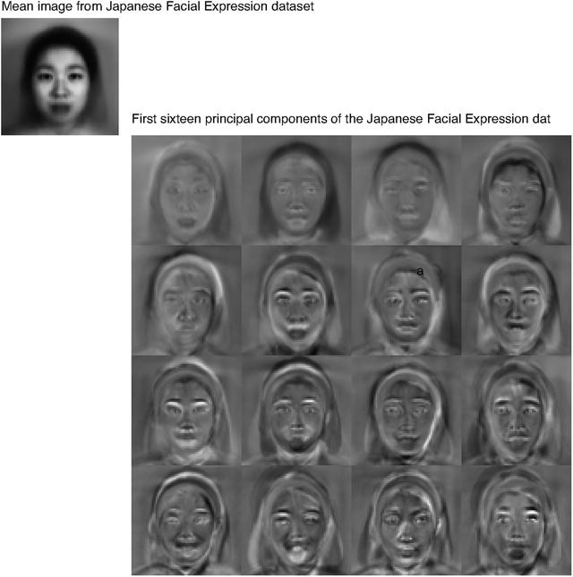

Fig. 10.13
On the left,the eigenvalues of the covariance
of the Japanese facial expression dataset; there are 4096, so it’s
hard to see the curve (which is packed to the left). On the
right, a zoomed version of
the curve, showing how quickly the values of the eigenvalues get
small
Fig. 10.14
The mean and first 16 principal components
of the Japanese facial expression dataset
Fig. 10.15
Approximating a face image by the mean and
some principal components; notice how good the approximation
becomes with relatively few components
The principal components sketch out the main
kinds of variation in facial expression. Notice how the mean face
in Fig. 10.14
looks like a relaxed face, but with fuzzy boundaries. This is
because the faces can’t be precisely aligned, because each face has
a slightly different shape. The way to interpret the components is
to remember one adjusts the mean towards a data point by adding (or
subtracting) some scale times the component. So the first few
principal components have to do with the shape of the haircut; by
the fourth, we are dealing with taller/shorter faces; then several
components have to do with the height of the eyebrows, the shape of
the chin, and the position of the mouth; and so on. These are all
images of women who are not wearing spectacles. In face pictures
taken from a wider set of models, moustaches, beards and spectacles
all typically appear in the first couple of dozen principal
components.
10.4 Multi-Dimensional Scaling
One way to get insight into a dataset is to plot
it. But choosing what to plot for a high dimensional dataset could
be difficult. Assume we must plot the dataset in two dimensions (by
far the most common choice). We wish to build a scatter plot in two
dimensions—but where should we plot each data point? One natural
requirement is that the points be laid out in two dimensions in a
way that reflects how they sit in many dimensions. In particular,
we would like points that are far apart in the high dimensional
space to be far apart in the plot, and points that are close in the
high dimensional space to be close in the plot.
10.4.1 Choosing Low D Points Using High D Distances
We will plot the high dimensional point
x i at v i , which is a two-dimensional
vector. Now the squared distance between points i and j in the high dimensional space is
 (where the superscript is to remind you that this is a squared
distance). We could build an N × N matrix of squared distances, which we
write
(where the superscript is to remind you that this is a squared
distance). We could build an N × N matrix of squared distances, which we
write  . The i, j’th entry in this matrix is
D ij (2)(x), and the x argument means that the distances are
between points in the high-dimensional space. Now we could choose
the v i to make
. The i, j’th entry in this matrix is
D ij (2)(x), and the x argument means that the distances are
between points in the high-dimensional space. Now we could choose
the v i to make
 as small as possible. Doing so should mean that points that are far
apart in the high dimensional space are far apart in the plot, and
that points that are close in the high dimensional space are close
in the plot.
as small as possible. Doing so should mean that points that are far
apart in the high dimensional space are far apart in the plot, and
that points that are close in the high dimensional space are close
in the plot.
. The i, j’th entry in this matrix is
D ij (2)(x), and the x argument means that the distances are
between points in the high-dimensional space. Now we could choose
the v i to make
In its current form, the expression is difficult
to deal with, but we can refine it. Because translation does not
change the distances between points, it cannot change either of the
 matrices. So it is enough to
solve the case when the mean of the points x i is zero. We can assume that
matrices. So it is enough to
solve the case when the mean of the points x i is zero. We can assume that
 Now write 1 for the
n-dimensional vector
containing all ones, and
Now write 1 for the
n-dimensional vector
containing all ones, and  for the identity matrix. Notice that
 Now write
![$$\displaystyle{\mathcal{A} = \left [\mathcal{I}- \frac{1} {N}\mathbf{1}\mathbf{1}^{T}\right ].}$$](A442674_1_En_10_Chapter_Equah.gif) Using this expression, you can show that the matrix
Using this expression, you can show that the matrix  , defined below,
 has i, jth entry x i ⋅ x j (exercises). I now argue that,
to make
has i, jth entry x i ⋅ x j (exercises). I now argue that,
to make  is close to
 , it is enough to make
 close to
  . Proving this will take us
out of our way unnecessarily, so I omit a proof.
. Proving this will take us
out of our way unnecessarily, so I omit a proof.
matrices. So it is enough to
solve the case when the mean of the points x i is zero. We can assume that
for the identity matrix. Notice that
, defined below,
is close to
, it is enough to make
close to . Proving this will take us
out of our way unnecessarily, so I omit a proof.We need some notation. Take the dataset of
N d-dimensional column vectors
x i , and form a matrix
 by stacking the vectors, so
![$$\displaystyle{\mathcal{X} = \left [\begin{array}{c} \mathbf{x}_{1}^{T} \\ \mathbf{x}_{2}^{T}\\ \ldots \\ \mathbf{x}_{N}^{T} \end{array} \right ].}$$](A442674_1_En_10_Chapter_Equaj.gif) In this notation, we have
In this notation, we have
 Notice
  is symmetric, and it is
positive semidefinite. It can’t be positive definite, because the
data is zero mean, so
is symmetric, and it is
positive semidefinite. It can’t be positive definite, because the
data is zero mean, so  .
.
by stacking the vectors, so
is symmetric, and it is
positive semidefinite. It can’t be positive definite, because the
data is zero mean, so .We must now choose a set of v i that makes  close to
  . We do so by choosing
a
. We do so by choosing
a  that is close to
 . But this means we must
choose
. But this means we must
choose ![$$\mathcal{V} = \left [\mathbf{v}_{1},\mathbf{v}_{2},\ldots,\mathbf{v}_{N}\right ]^{T}$$](A442674_1_En_10_Chapter_IEq83.gif) so that
so that  is close to
  . We are computing an
approximate factorization of the matrix
. We are computing an
approximate factorization of the matrix  .
.
close to . We do so by choosing
a that is close to
. But this means we must
choose
so that is close to . We are computing an
approximate factorization of the matrix .10.4.2 Factoring a Dot-Product Matrix
We seek a set of k dimensional v that can be stacked into a matrix
 . This must produce a
  that must (a) be as close as possible to
  and (b) have rank at most
k. It can’t have rank
larger than k because there
must be some
and (b) have rank at most
k. It can’t have rank
larger than k because there
must be some  which is N × k so that
  .
The rows of this
.
The rows of this  are our v i T .
. This must produce a
that must (a) be as close as possible to and (b) have rank at most
k. It can’t have rank
larger than k because there
must be some
which is N × k so that .
The rows of this
are our v i T .We can obtain the best factorization of
 from a diagonalization.
Write write
from a diagonalization.
Write write  for the matrix of eigenvectors of
  and
and  for
the diagonal matrix of eigenvalues sorted in descending order, so
we have
for
the diagonal matrix of eigenvalues sorted in descending order, so
we have
 and write
  for the matrix of positive square
roots of the eigenvalues. Now we have
for the matrix of positive square
roots of the eigenvalues. Now we have
 which allows us to write

from a diagonalization.
Write write
for the matrix of eigenvectors of and for
the diagonal matrix of eigenvalues sorted in descending order, so
we have
for the matrix of positive square
roots of the eigenvalues. Now we have
Now think about approximating  by the matrix
  . The error is a sum of
squares of the entries,
. The error is a sum of
squares of the entries,
 Because
  is a rotation, it is straightforward to
show that
is a rotation, it is straightforward to
show that
 But
But
 which means that we could find
  from the best rank
k approximation to
from the best rank
k approximation to
 .
This is obtained by setting all but the k largest entries of
.
This is obtained by setting all but the k largest entries of  to
zero. Call the resulting matrix
to
zero. Call the resulting matrix  . Then we have
 and
and
 The first k columns of
 are non-zero. We drop the remaining
N − k columns of zeros. The rows of the
resulting matrix are our v
i , and we can
plot these. This method for constructing a plot is known as
principal coordinate
analysis.
are non-zero. We drop the remaining
N − k columns of zeros. The rows of the
resulting matrix are our v
i , and we can
plot these. This method for constructing a plot is known as
principal coordinate
analysis.
by the matrix . The error is a sum of
squares of the entries,
is a rotation, it is straightforward to
show that
from the best rank
k approximation to
.
This is obtained by setting all but the k largest entries of to
zero. Call the resulting matrix . Then we have
are non-zero. We drop the remaining
N − k columns of zeros. The rows of the
resulting matrix are our v
i , and we can
plot these. This method for constructing a plot is known as
principal coordinate
analysis. This plot might not be perfect, because reducing
the dimension of the data points should cause some distortions. In
many cases, the distortions are tolerable. In other cases, we might
need to use a more sophisticated scoring system that penalizes some
kinds of distortion more strongly than others. There are many ways
to do this; the general problem is known as multidimensional scaling.
Procedure 10.3 (Principal Coordinate
Analysis)
Assume we have a matrix
D (2) consisting
of the squared differences between each pair of N points. We do not need to know the
points. We wish to compute a set of points in r dimensions, such that the distances
between these points are as similar as possible to the distances in
D (2).
-
Form
![$$\mathcal{A} = \left [\mathcal{I}- \frac{1} {N}\mathbf{1}\mathbf{1}^{T}\right ]$$](A442674_1_En_10_Chapter_IEq106.gif) .
. -
Form
 .
. -
Form
 ,
,  , such that
  (these
are the eigenvectors and eigenvalues of
(these
are the eigenvectors and eigenvalues of  ). Ensure that the entries of
 are sorted in decreasing order.
 -
Choose r, the number of dimensions you wish to represent. Form
 , the top left r × r block of
  . Form
  , whose entries are the
positive square roots of
, whose entries are the
positive square roots of  . Form
  , the matrix consisting of the first
r columns of
, the matrix consisting of the first
r columns of  .
.
Then
![$$\displaystyle{\mathcal{V}^{T} = \Lambda _{ r}^{(1/2)}\mathcal{U}_{ r}^{T} = \left [\mathbf{v}_{ 1},\ldots,\mathbf{v}_{N}\right ]}$$](A442674_1_En_10_Chapter_Equat.gif) is the set of points to plot.
is the set of points to plot.
10.4.3 Example: Mapping with Multidimensional Scaling
Multidimensional scaling gets positions (the
 of Sect. 10.4.1) from distances
(the
of Sect. 10.4.1) from distances
(the  of Sect. 10.4.1). This means we
can use the method to build maps from distances alone. I collected
distance information from the web (I used http://www.distancefromto.net, but
a google search on “city distances” yields a wide range of possible
sources), then applied multidimensional scaling. I obtained
distances between the South African provincial capitals, in
kilometers. I then used principal coordinate analysis to find
positions for each capital, and rotated, translated and scaled the
resulting plot to check it against a real map (Fig. 10.16).
of Sect. 10.4.1). This means we
can use the method to build maps from distances alone. I collected
distance information from the web (I used http://www.distancefromto.net, but
a google search on “city distances” yields a wide range of possible
sources), then applied multidimensional scaling. I obtained
distances between the South African provincial capitals, in
kilometers. I then used principal coordinate analysis to find
positions for each capital, and rotated, translated and scaled the
resulting plot to check it against a real map (Fig. 10.16).

of Sect. 10.4.1) from distances
(the of Sect. 10.4.1). This means we
can use the method to build maps from distances alone. I collected
distance information from the web (I used http://www.distancefromto.net, but
a google search on “city distances” yields a wide range of possible
sources), then applied multidimensional scaling. I obtained
distances between the South African provincial capitals, in
kilometers. I then used principal coordinate analysis to find
positions for each capital, and rotated, translated and scaled the
resulting plot to check it against a real map (Fig. 10.16).
Fig. 10.16
On the left, a public domain map of South
Africa, obtained from
http://commons.wikimedia.org/wiki/File:Map_of_South_Africa.svg,
and edited to remove surrounding countries. On the right, the locations of the cities
inferred by multidimensional scaling, rotated, translated and
scaled to allow a comparison to the map by eye. The map doesn’t
have all the provincial capitals on it, but it’s easy to see that
MDS has placed the ones that are there in the right places (use a
piece of ruled tracing paper to check)
One natural use of principal coordinate analysis
is to see if one can spot any structure in a dataset. Does the
dataset form a blob, or is it clumpy? This isn’t a perfect test,
but it’s a good way to look and see if anything interesting is
happening. In Fig. 10.17, I show a 3D plot of the spectral data,
reduced to three dimensions using principal coordinate analysis.
The plot is quite interesting. You should notice that the data
points are spread out in 3D, but actually seem to lie on a
complicated curved surface—they very clearly don’t form a uniform
blob. To me, the structure looks somewhat like a butterfly. I don’t
know why this occurs (perhaps the universe is doodling), but it
certainly suggests that something worth investigating is going on.
Perhaps the choice of samples that were measured is funny; perhaps
the measuring instrument doesn’t make certain kinds of measurement;
or perhaps there are physical processes that prevent the data from
spreading out over the space.

Fig. 10.17
Two views of the spectral data of
Sect. 10.3.3,
plotted as a scatter plot by applying principal coordinate analysis
to obtain a 3D set of points. Notice that the data spreads out in
3D, but seems to lie on some structure; it certainly isn’t a single
blob. This suggests that further investigation would be
fruitful
Our algorithm has one really interesting
property. In some cases, we do not actually know the datapoints as
vectors. Instead, we just
know distances between the datapoints. This happens often in the
social sciences, but there are important cases in computer science
as well. As a rather contrived example, one could survey people
about breakfast foods (say, eggs, bacon, cereal, oatmeal, pancakes,
toast, muffins, kippers and sausages for a total of 9 items). We
ask each person to rate the similarity of each pair of distinct
items on some scale. We advise people that similar items are ones
where, if they were offered both, they would have no particular
preference; but, for dissimilar items, they would have a strong
preference for one over the other. The scale might be “very
similar”, “quite similar”, “similar”, “quite dissimilar”, and “very
dissimilar” (scales like this are often called Likert scales). We collect these similarities from many people
for each pair of distinct items, and then average the similarity
over all respondents. We compute distances from the similarities in
a way that makes very similar items close and very dissimilar items
distant. Now we have a table of distances between items, and can
compute a  and produce a scatter plot. This plot
is quite revealing, because items that most people think are easily
substituted appear close together, and items that are hard to
substitute are far apart. The neat trick here is that we did not
start with a
and produce a scatter plot. This plot
is quite revealing, because items that most people think are easily
substituted appear close together, and items that are hard to
substitute are far apart. The neat trick here is that we did not
start with a  , but with just a set of distances; but
we were able to associate a vector with “eggs”, and produce a
meaningful plot.
, but with just a set of distances; but
we were able to associate a vector with “eggs”, and produce a
meaningful plot.
and produce a scatter plot. This plot
is quite revealing, because items that most people think are easily
substituted appear close together, and items that are hard to
substitute are far apart. The neat trick here is that we did not
start with a , but with just a set of distances; but
we were able to associate a vector with “eggs”, and produce a
meaningful plot.10.5 Example: Understanding Height and Weight
Recall the height-weight data set of
Sect. 1.2.4 (from http://www2.stetson.edu/~jrasp/data.htm;
look for bodyfat.xls at that URL). This is, in fact, a
16-dimensional dataset. The entries are (in this order):
bodyfat; density; age; weight;
height; adiposity; neck; chest; abdomen; hip; thigh; knee; ankle;
biceps; forearm; wrist. We know already that many of these
entries are correlated, but it’s hard to grasp a 16 dimensional
dataset in one go. The first step is to investigate with a
multidimensional scaling (Fig. 10.18).

Fig. 10.18
Two views of a multidimensional scaling to
three dimensions of the height-weight dataset. Notice how the data
seems to lie in a flat structure in 3D, with one outlying data
point. This means that the distances between data points can be
(largely) explained by a 2D representation
Section 1.2.4 shows a multidimensional
scaling of this dataset down to three dimensions. The dataset seems
to lie on a (fairly) flat structure in 3D, meaning that inter-point
distances are relatively well explained by a 2D representation. Two
points seem to be special, and lie far away from the flat
structure. The structure isn’t perfectly flat, so there will be
small errors in a 2D representation; but it’s clear that a lot of
dimensions are redundant. Figure 10.19 shows a 2D
representation of these points. They form a blob that is stretched
along one axis, and there is no sign of multiple blobs. There’s
still at least one special point, which we shall ignore but might
be worth investigating further. The distortions involved in
squashing this dataset down to 2D seem to have made the second
special point less obvious than it was in Sect. 1.2.4.

Fig. 10.19
A multidimensional scaling to two
dimensions of the height-weight dataset. One data point is clearly
special, and another looks pretty special. The data seems to form a
blob, with one axis quite a lot more important than another
The next step is to try a principal component
analysis. Figure 10.20 shows the mean of the dataset. The
components of the dataset have different units, and shouldn’t
really be compared. But it is difficult to interpret a table of 16
numbers, so I have plotted the mean as a stem plot.
Figure 10.21 shows the eigenvalues of the covariance
for this dataset. Notice how one dimension is very important, and
after the third principal component, the contributions become
small. Of course, I could have said “fourth”, or “fifth”, or
whatever—the precise choice depends on how small a number you think
is “small”.


Fig. 10.20
The mean of the bodyfat.xls dataset. Each
component is likely in a different unit (though I don’t know the
units), making it difficult to plot the data without being
misleading. I’ve adopted one solution here, by plotting a stem
plot. You shouldn’t try to compare the values to one another.
Instead, think of this plot as a compact version of a table
Fig. 10.21
On the left, the eigenvalues of the covariance
matrix for the bodyfat data set. Notice how fast the eigenvalues
fall off; this means that most principal components have very small
variance, so that data can be represented well with a small number
of principal components. On the right, the first principal component
for this dataset, plotted using the same convention as for
Fig. 10.20
Figure 10.21 also shows the first principal component.
The eigenvalues justify thinking of each data item as (roughly) the
mean plus some weight times this principal component. From this
plot you can see that data items with a larger value of
weight will also have
larger values of most other measurements, except age and density. You can also see how much
larger; if the weight goes up by 8.5 units, then the abdomen will
go up by 3 units, and so on. This explains the main variation in
the dataset.
In the rotated coordinate system, the components
are not correlated, and they have different variances (which are
the eigenvalues of the covariance matrix). You can get some sense
of the data by adding these variances; in this case, we get 1404.
This means that, in the translated and rotated coordinate system,
the average data point is about  units away from the center (the
origin). Translations and rotations do not change distances, so the
average data point is about 37 units from the center in the
original dataset, too. If we represent a datapoint by using the
mean and the first three principal components, there will be some
error. We can estimate the average error from the component
variances. In this case, the sum of the first three eigenvalues is
1357, so the mean square error in representing a datapoint by the
first three principal components is
units away from the center (the
origin). Translations and rotations do not change distances, so the
average data point is about 37 units from the center in the
original dataset, too. If we represent a datapoint by using the
mean and the first three principal components, there will be some
error. We can estimate the average error from the component
variances. In this case, the sum of the first three eigenvalues is
1357, so the mean square error in representing a datapoint by the
first three principal components is  , or 6. 8. The relative error
is 6. 8∕37 = 0. 18. Another way to represent this information,
which is more widely used, is to say that the first three principal
components explain all but (1404 − 1357)∕1404 = 0. 034, or 3. 4% of
the variance; notice that this is the square of the relative error,
which will be a much smaller number.
, or 6. 8. The relative error
is 6. 8∕37 = 0. 18. Another way to represent this information,
which is more widely used, is to say that the first three principal
components explain all but (1404 − 1357)∕1404 = 0. 034, or 3. 4% of
the variance; notice that this is the square of the relative error,
which will be a much smaller number.
units away from the center (the
origin). Translations and rotations do not change distances, so the
average data point is about 37 units from the center in the
original dataset, too. If we represent a datapoint by using the
mean and the first three principal components, there will be some
error. We can estimate the average error from the component
variances. In this case, the sum of the first three eigenvalues is
1357, so the mean square error in representing a datapoint by the
first three principal components is , or 6. 8. The relative error
is 6. 8∕37 = 0. 18. Another way to represent this information,
which is more widely used, is to say that the first three principal
components explain all but (1404 − 1357)∕1404 = 0. 034, or 3. 4% of
the variance; notice that this is the square of the relative error,
which will be a much smaller number.All this means that explaining a data point as
the mean and the first three principal components produces
relatively small errors. Figure 10.22 shows the second
and third principal component of the data. These two principal
components suggest some further conclusions. As age gets larger, height and weight get slightly smaller, but the
weight is redistributed; abdomen gets larger, whereas
thigh gets smaller. A
smaller effect (the third principal component) links bodyfat and abdomen. As bodyfat goes up, so does abdomen.

Fig. 10.22
On the left, the second principal component,
and on the right the third
principal component of the height-weight dataset
10.6 You Should
10.6.1 Remember These Definitions
-
Covariance 227
-
Covariance Matrix 229
10.6.2 Remember These Terms
-
symmetric 232
-
eigenvector 232
-
eigenvalue 232
-
principal components 237
-
color constancy 241
-
principal coordinate analysis 245
-
multidimensional scaling 245
-
Likert scales 247
10.6.3 Remember These Facts
-
Properties of the covariance matrix 230
-
Orthonormal matrices are rotations 233
-
You can transform data to zero mean and diagonal covariance 234
10.6.4 Use These Procedures
-
To diagonalize a symmetric matrix 233
-
To construct a low-d representation with principal components 240
-
To make a low dimensional map 246
10.6.5 Be Able to
-
Create, plot and interpret the first few principal components of a dataset.
-
Compute the error resulting from ignoring some principal components.
Problems
Summaries
10.1 You have a dataset {x} of N vectors, x i , each of which is d-dimensional. We will consider a
linear function of this dataset. Write a for a constant vector; then the value
of this linear function evaluated on the i’th data item is a T x i . Write f i = a T x i . We can make a new dataset
{f} out of the values of
this linear function.
- (a)
Show that
 (easy).
 - (b)
Show that
 (harder, but just push it through the definition).
 - (c)
Assume the dataset has the special property that there exists some a so that
 .
Show that this means that the dataset lies on a hyperplane.
.
Show that this means that the dataset lies on a hyperplane.
10.2 On Fig. 10.23, mark the mean of
the dataset, the first principal component, and the second
principal component.

Fig. 10.23
Figure for the question
10.3 You have a dataset {x} of N vectors, x i , each of which is d-dimensional. Assume that  has one non-zero eigenvalue. Assume that x 1 and x 2 do not have the same
value.
has one non-zero eigenvalue. Assume that x 1 and x 2 do not have the same
value.
has one non-zero eigenvalue. Assume that x 1 and x 2 do not have the same
value.
- (a)
Show that you can choose a set of t i so that you can represent every data item x i exactly

- (b)
Now consider the dataset of these t values. What is the relationship between (a)
 and (b) the non-zero
eigenvalue of
and (b) the non-zero
eigenvalue of  ?
Why?
?
Why?
Programming Exercises
10.4 Obtain the iris dataset from the UC
Irvine machine learning data repository at
https://archive.ics.uci.edu/ml/machine-learning-databases/iris/iris.data.
- (a)
Plot a scatterplot matrix of this dataset, showing each species with a different marker.
- (b)
Now obtain the first two principal components of the data. Plot the data on those two principal components alone, again showing each species with a different marker. Has this plot introduced significant distortions? Explain
10.5 Take the wine dataset from the UC
Irvine machine learning data repository at https://archive.ics.uci.edu/ml/datasets/Wine.
- (a)
Plot the eigenvalues of the covariance matrix in sorted order. How many principal components should be used to represent this dataset? Why?
- (b)
Construct a stem plot of each of the first 3 principal components (i.e. the eigenvectors of the covariance matrix with largest eigenvalues). What do you see?
- (c)
Compute the first two principal components of this dataset, and project it onto those components. Now produce a scatter plot of this two dimensional dataset, where data items of class 1 are plotted as a ‘1’, class 2 as a ‘2’, and so on.
10.6 Take the wheat kernel dataset from
the UC Irvine machine learning data repository at http://archive.ics.uci.edu/ml/datasets/seeds.
Compute the first two principal components of this dataset, and
project it onto those components.
- (a)
Produce a scatterplot of this projection. Do you see any interesting phenomena?
- (b)
Plot the eigenvalues of the covariance matrix in sorted order. How many principal components should be used to represent this dataset? why?
10.7 The UC Irvine machine learning data
repository hosts a collection of data on breast cancer diagnostics,
donated by Olvi Mangasarian, Nick Street, and William H. Wolberg.
You can find this data at
http://archive.ics.uci.edu/ml/datasets/Breast+Cancer+Wisconsin+(Diagnostic).
For each record, there is an id number, 10 continuous variables,
and a class (benign or malignant). There are 569 examples. Separate
this dataset randomly into 100 validation, 100 test, and 369
training examples. Plot this dataset on the first three principal
components, using different markers for benign and malignant cases.
What do you see?
10.8 The UC Irvine Machine Learning data
archive hosts a dataset of measurements of abalone at http://archive.ics.uci.edu/ml/datasets/Abalone.
Compute the principal components of all variables except Sex. Now
produce a scatter plot of the measurements projected onto the first
two principal components, plotting an “m” for male abalone, an “f”
for female abalone and an “i” for infants. What do you see?
10.9 Choose a state. For the 15 largest
cities in your chosen state, find the distance between cities and
the road mileage between cities. These differ because of the routes
that roads take; you can find these distances by careful use of the
internet. Prepare a map showing these cities on the plane using
principal coordinate analysis for each of these two distances. How
badly does using the road network distort to make a map distort the
state? Does this differ from state to state? Why?
10.10 CIFAR-10 is a dataset of 32 × 32
images in 10 categories, collected by Alex Krizhevsky, Vinod Nair,
and Geoffrey Hinton. It is often used to evaluate machine learning
algorithms. You can download this dataset from https://www.cs.toronto.edu/~kriz/cifar.html.
- (a)
For each category, compute the mean image and the first 20 principal components. Plot the error resulting from representing the images of each category using the first 20 principal components against the category.
- (b)
Compute the distances between mean images for each pair of classes. Use principal coordinate analysis to make a 2D map of the means of each categories. For this exercise, compute distances by thinking of the images as vectors.
- (c)
Here is another measure of the similarity of two classes. For class A and class B, define E(A → B) to be the average error obtained by representing all the images of class A using the mean of class A and the first 20 principal components of class B. Now define the similarity between classes to be (1∕2)(E(A → B) + E(B → A)). Use principal coordinate analysis to make a 2D map of the classes. Compare this map to the map in the previous exercise—are they different? why?