13 asymmetry
“Asymmetry is the rhythmic expression of functional design.”
JAN TSCHICHOLD (GERMAN, 1902–1974) Author, Book Designer, Educator, Typographer
asym·me·try \(‚)ā-'si-mə-trē\ n
1: lack of balance or symmetry
Asymmetry is the opposite of symmetry. Asymmetrical balance, also called informal balance, means without symmetry. This definition by itself has nothing to do with balance. It means only that images within a composition do not mirror one another. The term, however, is usually used to describe a kind of balance that does not rely upon the principle of symmetry. With asymmetry, one dominant form or compositional element is often offset by smaller forms or compositional elements. In general, asymmetrical compositions tend to have a greater sense of visual tension than symmetrically balanced compositions.

The symbol for Overture, a web search engine, is composed of a series of concentric O’s organized in an asymmetrical perspective that further conveys balance and movement, as well as referencing a target, informational hierarchy, and unlimited reach. This asymmetrical symbol also takes on an added visual dynamic when used as a greeting in reflected neon, cropped top and bottom, and interpreted as an environmental graphic wall mural.
C+G PARTNERS LLC
New York, NY, USA
References in Nature
Asymmetry in nature is uncommon and is a skill development trait identified as “handedness,” a property of an object (such as a living organism) that is not identical with its mirror image. This is fully evident in a person’s tendency to use one hand rather than the other.
Other examples of handedness and left-right asymmetries in nature are the left dolphin lung that is smaller than the right to make room for its asymmetrical heart; a fiddler crab’s different-size large and small claws; the narwhal’s left incisor tusk, which can grow up to 10 feet (3 m) long and form a left-handed helix; the eyes of a flatfish, located on one side of its head so it swims with one side upward; and several species of owls whose size and ear position assists them in locating their prey.

J. Christopher Capital’s stationery is identified with a centered monogramlike logotype and organized within asymmetrical compositions for its letterhead, envelope, and business card.
HINTERLAND
New York, NY, USA
1937
Konstruktivisten Poster
JAN TSCHICHOLD
Basel, CH
Jan Tschichold and Die Neue Typographie
JAN TSCHICHOLD (1902–1974) was born in Leipzig, Germany, the eldest son of a sign painter and calligrapher. He studied calligraphy, engraving, typography, and book arts at Leipzig’s Academy for Graphic Arts and Book Production. Soon after establishing himself as a graphic designer, he became aware of the need for a new approach to typography.
At the time, typography was based on the principle of centered type or symmetry, using frame, border, and ornament to provide further texture, distinction, and individuality to each composition. Tschichold identified this approach as the “box block style” of typography, an approach that was predictable, uninteresting, and outdated.
In August 1923, he attended the first Bauhaus exhibition in Weimar and quickly started to assimilate this new design philosophy. Influenced and informed by the work of modern avant-garde artists and designers such as Herbert Bayer (Austrian, 1900–1985), Paul Klee (German, 1879–1940), El Lissitzky (Russian, 1890–1941), and Piet Zwart (Dutch, 1885–1977), Tschichold wanted to liberate visual form from its restrictive rules and provide designers with greater freedom and flexibility.
He believed that typographic information had to be purely functional and composed in a clear and precise manner, or else it would be ignored. Starting in 1925, he began writing a series of articles and publications proposing a revolutionary approach to a “new” typography—an approach strongly influenced by both the Bauhaus and the Russian Constructivists.
The major tenets of the New Typography were asymmetric compositions of elements based on their relative importance, the preference for sans serif type, and the creative use of white space. These tenets were ultimately summarized in Tschichold’s treatise titled Die Neue Typographie (The New Typography, 1928) and in Typographische Gestaltung (Asymmetric Typography, 1935).
In 1926, he was appointed by Paul Renner (German, 1878–1956) to teach typography and lettering at the Munich Meisterschule fur Deutschlands Buchdrucker, and he continued to lecture there until 1933.
In 1933, Tschichold was arrested and accused by the Nazis of being a “cultural Bolshevik,” creating “un-German” typography. Soon after his release, he and his family immigrated to Basel, Switzerland. In the later part of his life, Tschichold ultimately embraced principles of both symmetry and asymmetry, as well as the use of serif and sans serif typography in his work.


The asymmetrical balance of this page spread is achieved simply with the effective use of scale, proportion, and grid. Reliance on extreme large- and small-scale photographic images, a dynamic layout of typographic columnar text, and activation of a flexible page grid all add to the visual impact and kinetic qualities that can be achieved with an asymmetrical composition.
STUDIO JOOST GROOTENS
Amsterdam, NL
Compositional Characteristics
Asymmetry is achieved when one side of a visual composition does not reflect the other side. Asymmetrical balance is a type of visual balance in which compositional elements are organized so that one side differs from the other without impacting the composition’s overall harmony. Consequently, when an asymmetrical composition is disturbingly off balance, the result is jarring and disorienting.
As a compositional principle of visual communications, asymmetrical balance is more complex and more difficult to achieve than symmetrical balance. It involves organizing compositional elements in a way that will allow elements of varying visual weight to balance one another around an axis or pivot point. This can be best visualized as a literal balance scale that represents visual weights in a two-dimensional composition. For example, it is possible to balance a heavy weight with a group of lighter weights on equal sides of a pivot point. In a visual composition, this might be a cluster of small elements balanced by a larger one. It is also possible to imagine compositional elements of equal weight but different mass (such as a large mass of feathers versus a small mass of stones), on equal sides of a pivot point. Unequal visual weights can also be balanced by shifting the pivot on this imaginary scale.

This poster for promoting developing artists’ films and videos throughout the United Kingdom relies upon the immediacy and power of pure typography and is organized in an asymmetrical composition to gain and hold the viewer’s attention. An obvious hierarchy of typographic sizes and colors, as well as the use of horizontal, linear rules to highlight, group, and separate information, makes this poster easily and readily accessible to the reader.
FRASER MUGGERIDGE
London, UK

This 74-foot-high (22.6 m) sandblasted limestone tablet engraved with the forty-five words of the First Amendment is traditionally composed with serif all-cap letterforms in an asymmetrical organization, and located on the modernist, all-glass façade of the Newseum building, also in an asymmetrical manner. This treatment accentuates the large-scale typography as a bas-relief and permanently displays the first amendment as a timeless element set in a modern context.
POULIN + MORRIS INC.
New York, NY, USA


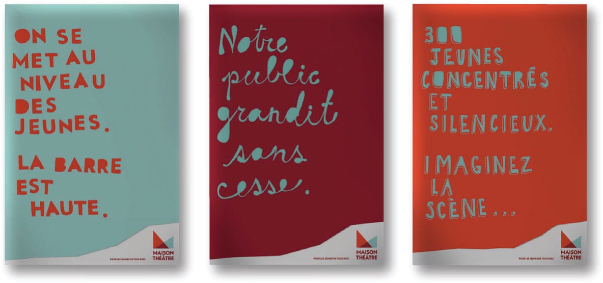
Maison Theatre’s playful and childlike symbol is composed of two triangular, transparent color shapes layered on top of one another to create a third unique triangular shape. An all-cap treatment of the theater’s name functions as a typographic base for this asymmetrically balanced symbol. To further appeal to a youthful audience, the symbol is applied to a variety of print collateral materials with bright saturated colors, hand-drawn letterforms and script lettering, and triangular patterning—all active and dynamic asymmetrical compositions, reinforcing the unique, visual character of the theatre’s overall message and brand.
LG2BOUTIQUE
Montreal, QUE, CA

Perricone MD’s branding campaign includes packaging, website, advertising, and promotional sales collateral that reflect a modern visual interpretation of a traditional apothecary—understated, small-scale serif typography; scientific photography; frosted amber glass contain-ers—all organized and composed in an asymmetrical and balanced manner.
MONNET DESIGN
Toronto, ONT, CA

The cover for The Good Men Project: Real Stories from the Front Lines of Modern Manhood uses asymmetry to create visual tension, balance, and eye-catching recognition for the buyer and reader. These characteristics are further strengthened with the effective use of an iconic photographic image, bold typography, vibrant color, and distinctive proportions.
POULIN + MORRIS INC.
New York, NY, USA
Asymmetrical balance is informal and generally more active and dynamic than symmetrical balance. While symmetrical balance is achieved through repetition, asymmetrical balance is completely dependent upon contrast and counterpoint in a composition. It results from combining contrasting design elements, such as point, line, shape, form, and color, evenly distributed along an axis of a composition.
Asymmetry is also a compositional state where elements are organized in a nonsystematic and organic manner to achieve visual balance. This type of visual balance relies upon the critical interaction and integrity of compositional elements and negative space, as well as their location and proximity to one another, to create tension, balance, and meaning in any visual communication.
These types of balanced compositions are inherently active and kinetic, and communicate the same to the viewer.
Asymmetrical compositions require a more disciplined and analytical eye due to their unique and ever-changing spatial requirements. Here you have to constantly and consistently evaluate and assess potential compositional solutions based on spatial relationships varying from element to element and size to size, whether positive or negative, figure or ground.
In visual communications, your reliance on the principle of asymmetry in creating asymmetrical compositions increases the viewer’s ability to organize, differentiate, and interact with a broad range of visual content.

The varying visual weight of the photographic and typographic elements in this promotional poster for The New Group Theater creates an asymmetrical composition that is fully balanced due to contrasts and counterpoints evident in the scale, color, and tone of the poster’s compositional elements.
ROGERS ECKERSLEY DESIGN (RED)
New York, NY, USA

The overall asymmetrical composition of this brochure cover for the Old Police Headquarters building, a renovated, historic, mixed-use real estate development in downtown San Diego, is reinforced by asymmetrical characteristics of the cover—the composition of its typographic elements and the cropping of its photographic image as well as the cropping and placement of the project symbol bleeding off the right-hand edge of the cover.
URBAN INFLUENCE DESIGN STUDIO
Seattle, WA, USA

Future Flight, a promotional poster for the Australian Graphic Design Association, functions as an announcement for a series of member programs and offerings. The immediacy and dynamic visual character of this poster is solely due to its asymmetrical composition. Additionally, the use of varied colors and scales of paper planes, as well as their illusive appearance of ascending and flying beyond the edges of the poster, strengthens the asymmetry of this composition.
LANDOR
Paris, FR

These covers for Blueprint, an architectural magazine, reflect optimum readability, legibility, emphasis, hierarchy, and scale by relying upon an asymmetrical page grid that allows varied narrative and visual content to be treated in a meaningful and accessible manner. Varied content includes large-scale typography, architectural drawings, photography, illustrations, captions, and narrative text.
PAOLO COCKRIEL, Student ADRIAN PULFER, Instructor
BRIGHAM YOUNG UNIVERSITY
Provo, UT, USA
