17 abstraction
“A designer knows that he has achieved perfection not when there is nothing left to add, but when there is nothing left to take away.”
ANTOINE DE SAINT-EXUPÉRY (FRENCH, 1900–1944) Author
ab·strac·tion \ab-'strak-shən, əb-\ n
1: considered apart from concrete existence
2: not applied or practical; theoretical
3: having intellectual and affective artistic content that depends solely on intrinsic form rather than on narrative content or pictorial representation
Abstraction is independent of our visual world. It is an illusion of our own visible reality and solely a sensory experience. In graphic design, abstraction provides us with alternative ways of communicating visual messages containing specific facts and experiences. It is a visual language that does not rely upon the literal nature of things—familiar and identifiable to us in our own world. Relying on an abstract visual language can reshape the familiar into the expressive. It is free from objective content, context, and meaning. It can be symbolic, interpretive, imaginary, impressionistic, nonrepresentational, nonobjective, or nonfigurative.

Simplification and distillation of letterforms using different light fixtures and bulbs is the primary visual metaphor for this promotional poster announcing an American Institute of Architects San Diego–sponsored conference. The conference title, “If Not, Then When?” spelled out in an abstract manner further conveys the theme of the conference, which explores how the practice of architecture is being transformed in the twenty-first century.
MENDE DESIGN
San Francisco, CA, USA
Historical References
Abstraction is not a twentieth-century phenomenon. It has been a part of our visual language since early mankind. From naïve graphic gestures found in prehistoric cave paintings and stylized hieroglyphs in Egyptian funereal tombs to graphic emblems used in medieval science, heraldry, and religious rituals, abstraction is an integral design principle in all of these visual forms.

The abstract outline of a heart in this symbol suggests a human-centered approach to healthcare, beyond the traditional realms of science, chemistry, and manufacturing for the pharmaceutical company Kyorin. Continuing this human viusal metaphor, the center of the symbol is an “inner smile.”
C+G PARTNERS LLC
New York, NY, USA
1945
Nightwood Book Cover
ALVIN LUSTIG
New York, NY, USA
Alvin Lustig and New Directions
One of the most prolific collaborations between a graphic designer and client in twentieth-century American design was the one shared by Alvin Lustig (1915–1955) and the progressive publisher New Directions Books in the 1940s and 1950s. During this time period, Lustig designed dozens of groundbreaking book covers and jackets for the Modern Reader and New Classics book series for New Directions.
A designer, writer, and educator in Los Angeles and New York City, Lustig was one of the first designers to approach his craft and profession in a nonspecialized manner. He believed that all design was a matter of form and content and that the role of the designer was that of a synthesizer, not of a style maker. His diverse work included books, book jackets, advertisements, magazines, trademarks, letterheads, catalogs, record albums, sign systems, furniture, textile design, interior design, product design, and architecture.
Lustig’s first New Directions book covers began as an experiment with geometric patterns, but soon he was adapting forms familiar to him from his knowledge of modern painting. Within a few years, Lustig was incorporating biomorphic glyphs or what he called symbolic “marks” that recalled the work of abstract modernist painters such as Paul Klee (German, 1879–1940), Joan Miró (Spanish, 1893–1983), Clyfford Still (American, 1904–1980), and Mark Rothko (American, 1903–1970). His most striking and memorable book jackets combined modern typography with complex fields of line, shape, form, color, texture, and image.
He explained, “The primary intention in designing the book jackets of the New Directions series was to establish for each book a quickly grasped, abstract symbol of its contents as a sheer force of form and color, to attract and inform the eye. Such a symbol is a matter of distillation, a reduction of the book to its simplest terms of mood or idea. The spirit of the book cannot be expressed by naturalistic representation of episodes or by any preconceived formal approach, but can only develop naturally from its own nature.”
The reliance on modernist visual form was a means of communicating the book publisher’s commitment to an intellectual literary tradition distinct from the mainstream—a new and sophisticated visual language that at once created and affirmed New Directions’ place within a highly competitive and overcrowded market.
Lustig’s visionary “distillation” of form and image developed into a complex, abstract, efficient, and resolutely modern visual language, simplified yet never simplistic, unique yet never forgettable.


This cover series for a set of Irvine Welsh (Scottish, b. 1958) novels uses abstract illustrations to further enhance the design of each cover and convey the raw, emotional themes of each book. Saturated colors, bold sans serif, all cap letterforms, and textures collectively add power and impact to the expressive qualities of each of these compositions.
JAMUS MARQUETTE, Student
KEVIN BRAINARD, Instructor
SCHOOL OF VISUAL ARTS
New York, NY, USA


Levels of Abstraction
Abstract visual language is created by simplifying and distilling form and content. It depends solely upon its own intrinsic form rather than on narrative content or pictorial representation. A graphic designer who relies upon abstraction as a means to communicate a visual message also requires the viewer to connect immediately, intuitively, and emotionally with that same message.
There are different degrees or levels of abstraction in visual communications, from the least abstract to the most abstract.
For example, a photographic image (closer to a true representation than any other image type, such as illustration) has the lowest level of abstraction, since it only replicates the actual content or meaning of the actual image. Exact duplication of the reality represented in a photographic image is not possible because that reality is distorted as soon as the photographer takes the photograph, as well as in the viewer’s visual perception and interpretation of that photographic image.

The cracked slab of limestone used in this poster is an abstract visual metaphor representing the legendary city of Bam and its citadel located in southern Iran, which was among the world’s most famous architectural landmarks. In 2003, an earth-quake destroyed the city and caused the death of more than 40,000 people. For the first anniversary of this earthquake, this promotional poster announced an exhibition and conference on the potential renovation of the city.
STUDIO ABBASI
Tehran, IR

The mission of Amphibian Stage Productions, a theatrical production company, is to produce “innovative and engaging” theatrical works that challenge the way people see the world around them. This brand identity draws from abstract amphibian forms and patterns used to create a visual vocabulary appealing to all theatergoers—young and old.
ALFALFA STUDIO LLC
New York, NY, USA
The next level of abstraction is not based on reality or any recognizable form, but is represented by signs or something else to communicate a visual message. Letterforms, numbers, punctuation, and words are all signs—representations or visual expressions of written and verbal language.
The highest level of abstraction is evident in glyphs, pictograms, and symbols. These graphic forms are more abstract than signs because their meaning can be interpreted by the viewer on many levels. Symbols are not realistic in graphic form but represent concepts and ideas, which may be reflected spiritually, socially, politically, sexually, or culturally. For example, a triangle can represent inspiration, the gay-rights movement, or oppression in Nazi Germany during World War II.

The typography in this theatrical poster for a production of Shakespeare’s Macbeth has been abstracted to a certain degree to imply a towering castlelike wall enclosing an environment that will have to be breached and broken down, but it still maintains an immediate identity for the title of the play. Color, typographic form, exaggerated scale, contrast, and proportion all add to the overwhelmingly dark and serious tone of this message.
CATHERINE ZASK
Paris, FR

Both of these posters, titled You Will Mingle and Meet Girls, use expressive abstractions of a person’s eye and head to communicate the intensity and anxiety one can feel when considering these natural yet uncomfortable social situations. Supporting typography functions as a narrative counterpoint to each visual representation.
JASON LYNCH, Student
WILLIAM MORRISEY, Instructor
SCHOOL OF VISUAL ARTS
New York, NY, USA


This series of stylized graphic variations for Alfred A. Knopf Publishers’ classic Borzoi dog symbol use visual simplification, interpretation, and abstraction as a means to update and provide alternative graphic choices when incorporating the symbol on various book titles and spines.
TRIBORO
Brooklyn, NY, USA
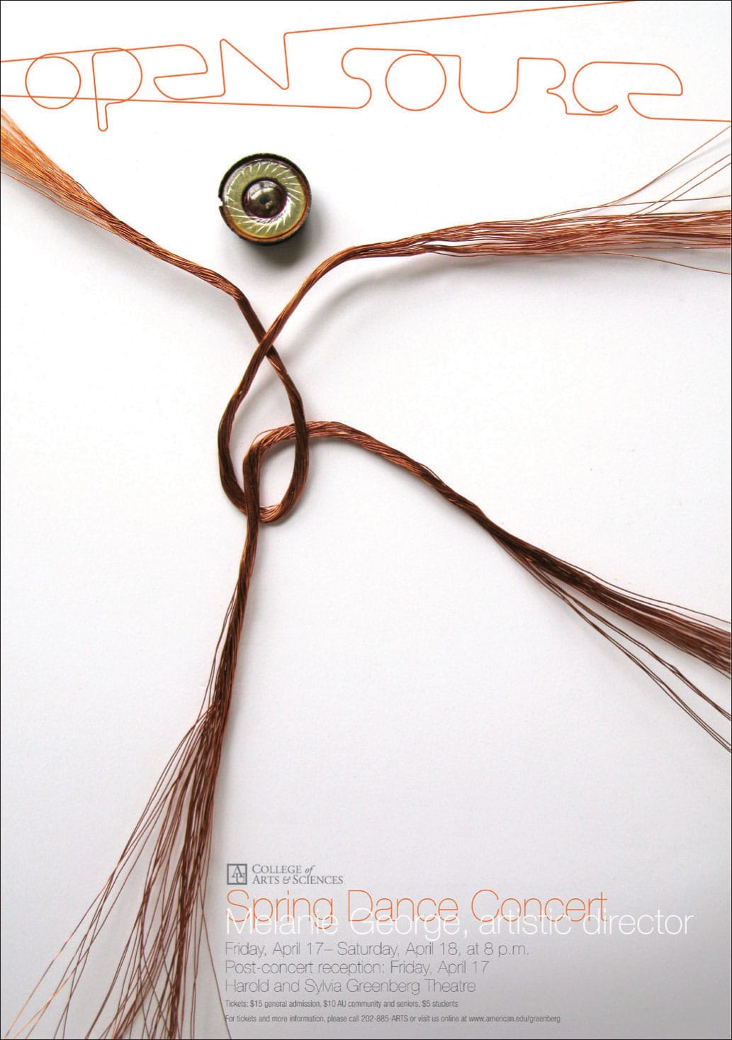
An abstract human form made from found objects—threads and a button—and represented in a manner that is both lyrical and dancelike becomes a powerful and memorable figurative icon for this poster announcing a spring dance concert. Custom-drawn, lowercase letterforms identifying “open source” are also abstracted, evoking visual qualities similar to the reductive human form directly below this titling.
CHEMI MONTES DESIGN
Arlington, VA, USA
Total abstraction bears no trace of any visual reference to anything recognizable. For example, color is completely free of objective representation and is an abstract visual form.
Using abstraction in visual communications provides you with a broad palette of graphic form that has no concrete meaning yet can evoke powerful, memorable, and meaningful visual messages and responses.

In this poster for a performance by Henri Meschonnic (1932–2009), a French essayist, poet, and theorist of language, the image of a man is reduced and abstracted to an illusive visual gesture. It appears figurative and, at the same time, not figurative. It is unfamiliar, yet engaging. Sans serif typography oriented on a vertical axis acts as a strong counterpoint and frame for this image, giving it added strength and presence in the composition.
CATHERINE ZASK
Paris, FR